Workspace
Problem
The most basic concept in Rainforest QA is a test. A test contains an action (like Click, Type, and Hover) and element (screenshots of buttons, text fields, etc.)

A test is created so they can be run by a Virtual Machine – either on a schedule (hourly, daily, etc.) or in response to code changes (PRs).
Each time a test is run, it creates a result: a video replay of the test, broken up into steps. Results either pass successfully from start to finish, or failed somewhere along the way.
And when you’re working in a team and managing many tests, logic follows that you’d need an overview – to see trends and remove bottlenecks.
Rainforest had built a Dashboard to visualise those data.

Almost everybody skipped it and immediately went somewhere else.
This is a project to design a new start page that people actually want to use.
Design Process
We interviewed some of Rainforest QA’s most active customers and asked them about activities they spent the most time doing in the app.
Most of them answered confidently: test maintenance.
Maintenance means that, when results fail, they’d have watch the replay video to determine the cause. In those videos, two problems almost always happened:
- App bug: the test surfaced something wrong with their app
- Test needs refactor: the test is out of date with the latest functionality of their app
In this project, our team was lucky to have identified the problem quite clearly, and early on. It meant that I was able to get to the UI design fairly quickly.
Challenges
Getting to failed results involved multiple steps.
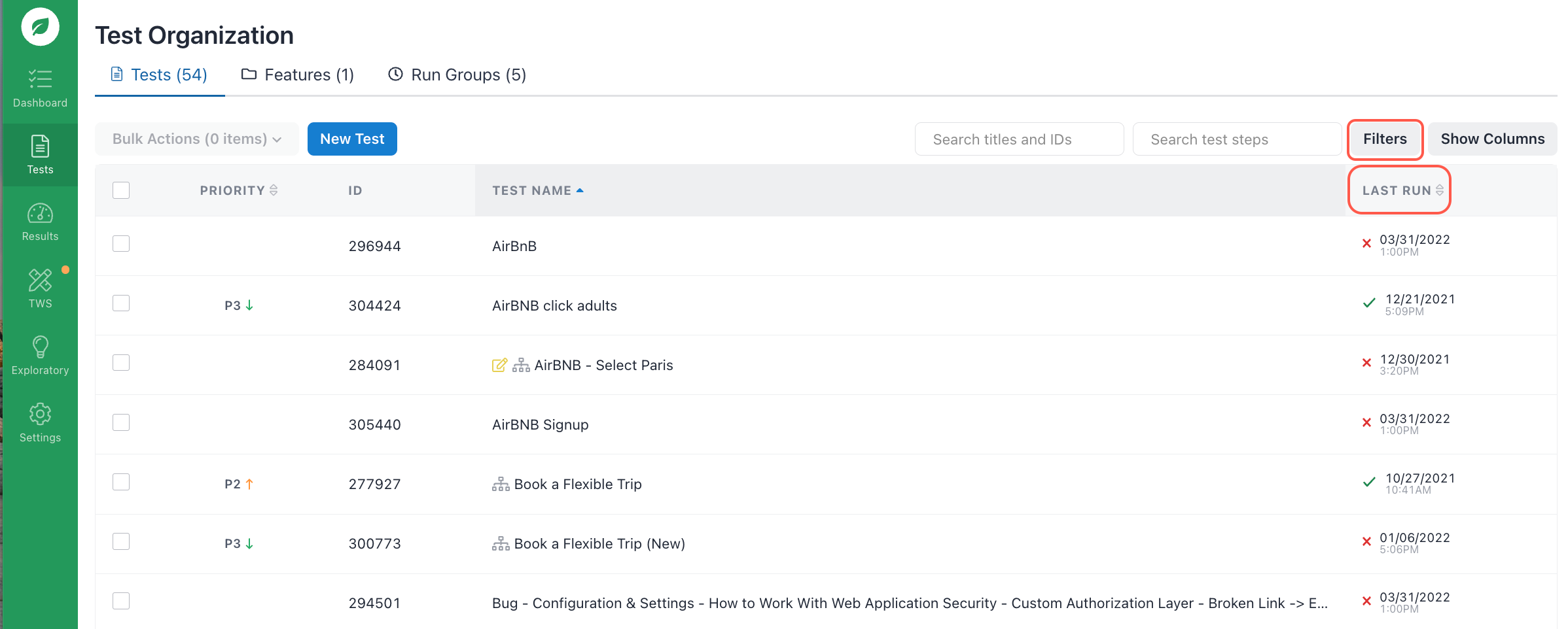
Firstly, users had to go to the Test Organization page – skipping the Dashboard.
Secondly, they either:
- Sort by Last Run (failed results will appear first), or
- Go to Filters and search for tests with failed results
Even after locating the culprit, their job was still not finished. They still needed to:
- Go into the result
- Watch the video replay
- Determine what went wrong with the test
- Either fix the failure on the spot, or categorise and fix it later

This workflow is indirect and incredibly slow.
Breakthrough
We could simply show a list of failed results, make it a new start page, and leave it at that. Doing this would’ve already saved users time and effort.
But we wanted to go further and provide an even more direct means of triage. We posed a challenge to Engineering: can we make the list itself actionable?
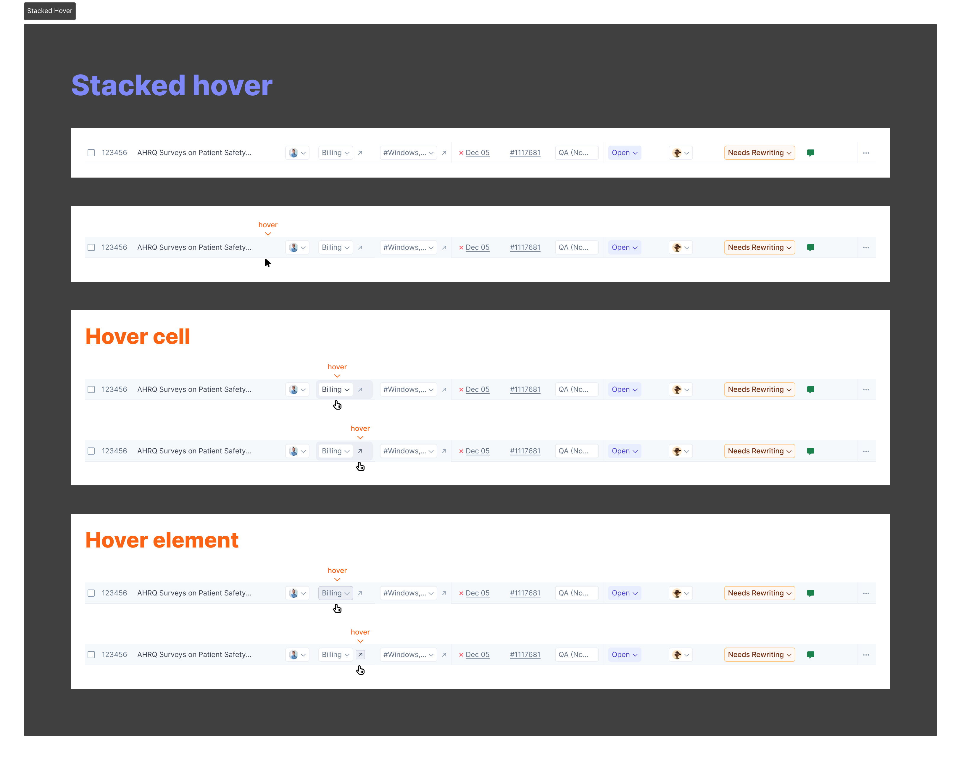
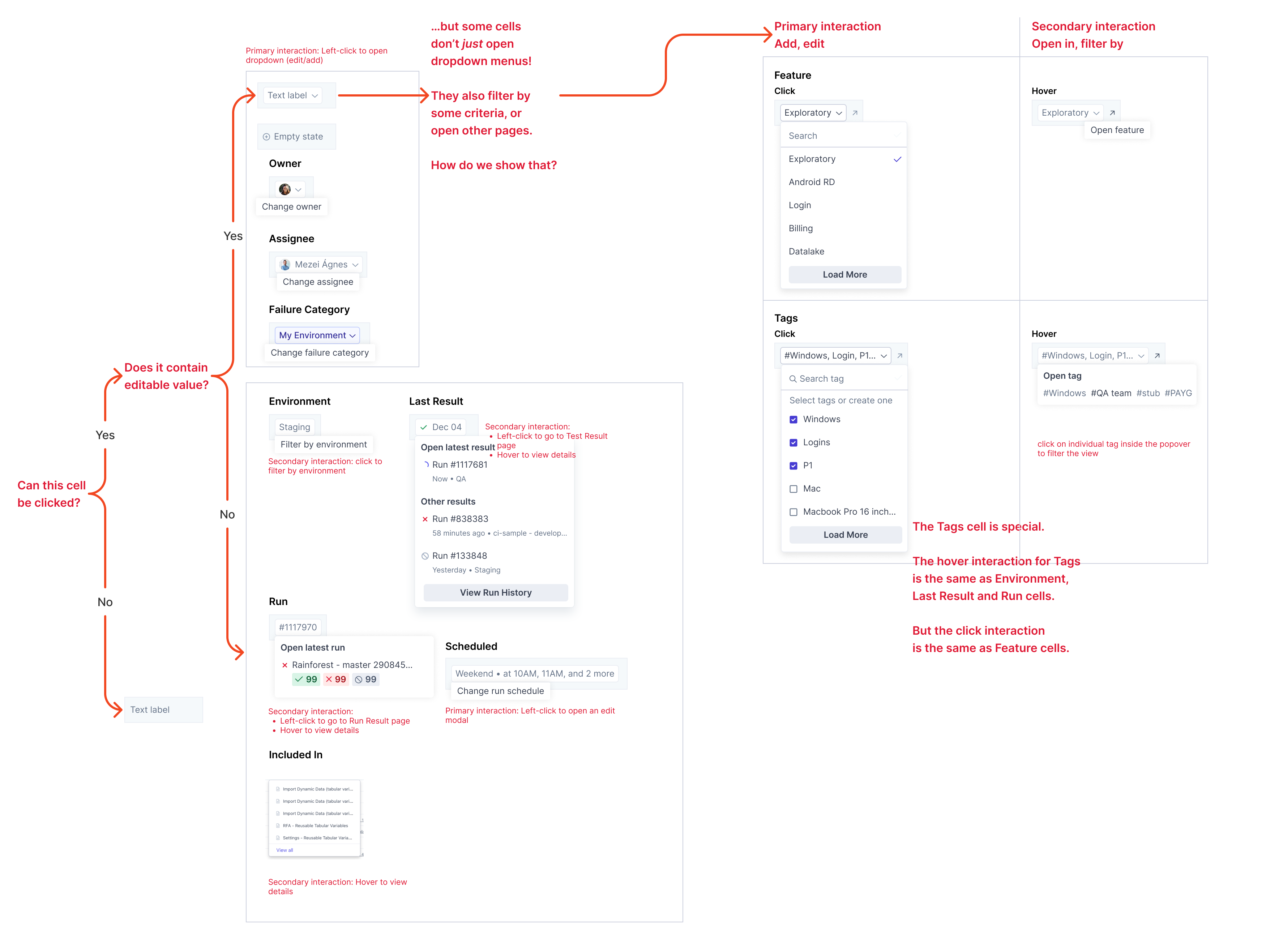
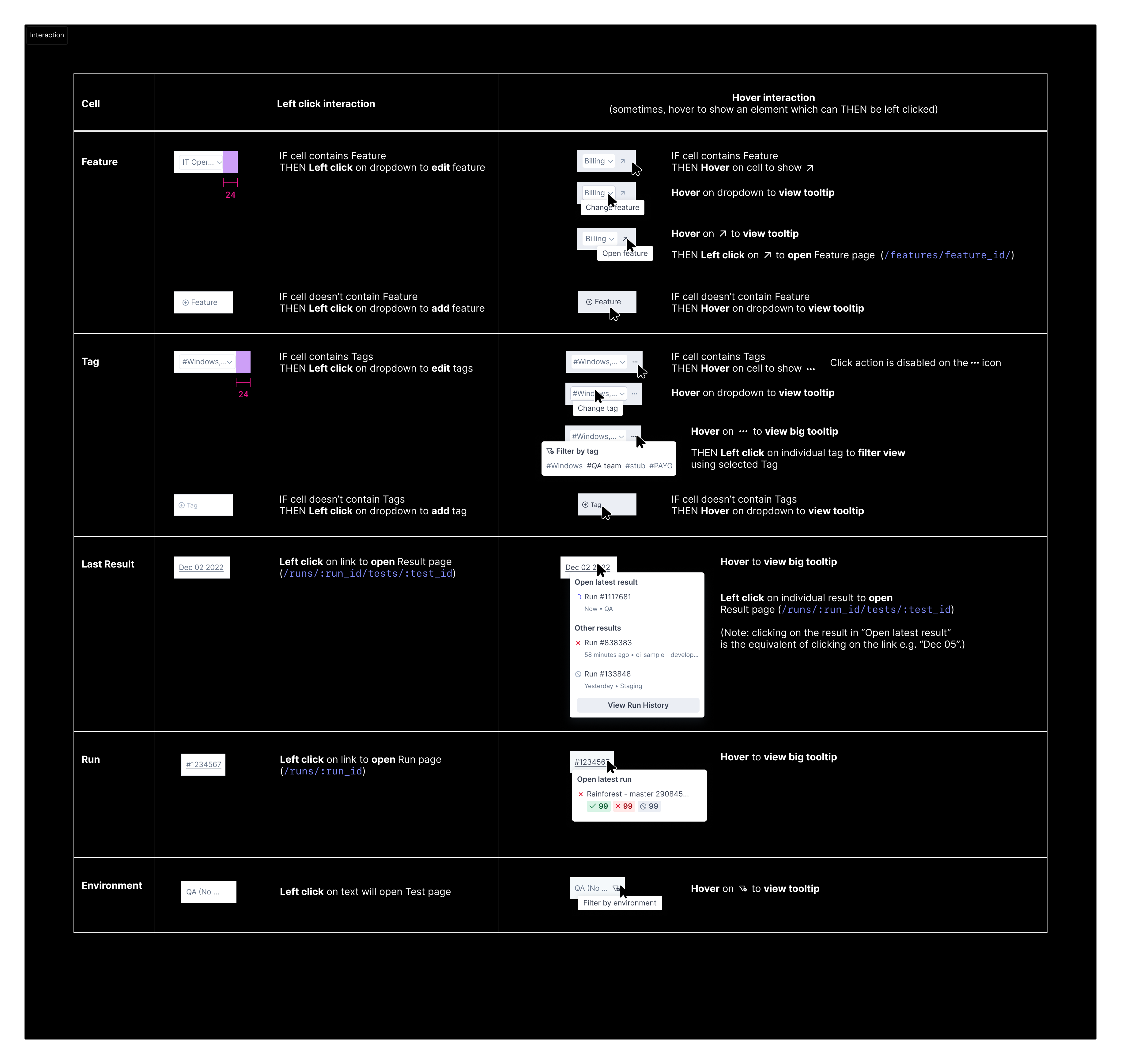
Up to this point, any Rainforest list item can only be selected to open another page. Now, we needed to make that list item work harder. It needed to contain sub-elements that are actionable in-context, without opening another page.
Minimum Viable Integration
We didn’t implement this design all at once. While our Engineers were figuring out how to make sub-elements actions a reality, we decided that we could show our users first – a taste of what’s to come – and get their feedback.
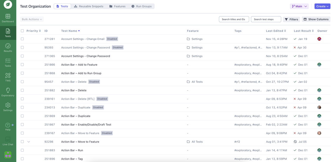
This was our first phase of the project’s implementation: showing multiple columns in the existing Test Organization page.
Result
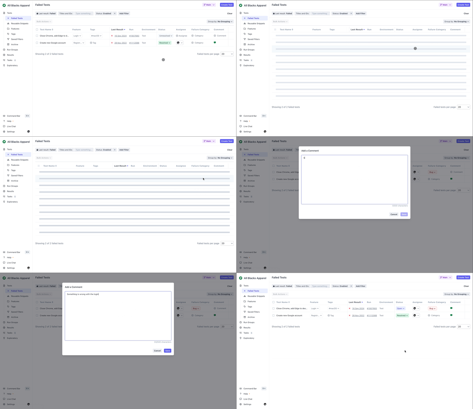
On the second phase of implementation, we launched Workspace in full. It’s now called ‘Failed Tests’, and we made it the new Rainforest QA start page.

From here, users can not only see a list of their failed results. They can also take action on those results: categorise, assign and describe – all without leaving the page.
